After I published my recent article on Inclusive Illustration Research: How Emojis Handle Skin Tones, a few friends suggested I look into how makeup brands approach skin tones. The reader implied that I was giving too much weight to a skin tone system created by the Unicode Consortium, a generally corporate, male and technical organization, for whom emojis (and by extension skin tones) are but a small sliver of their responsibility. For many makeup brands though, getting the skin tone right is a core part of their business.

They suggested I sample colors from foundation product lines, which are a pretty good proxy for skin color as “a skin-coloured makeup applied to the face to create an even, uniform colour to the complexion, to cover flaws and, sometimes, to change the natural skintone.” (Wikipedia) As the description states, it’s not a 100% replica of natural skin color, but it’s probably more representative and inclusive than the Fitzpatrick Scale (a system used to measure sun tans), which is currently what emojis are using to create a skin tone palette.
How makeup brands classify color
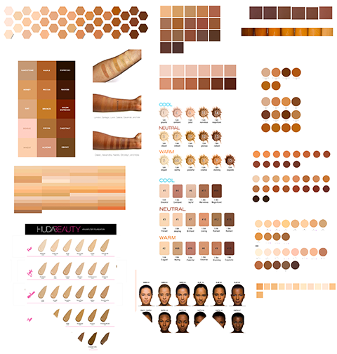
Differently. Here’s an excerpt of the various foundation skin tone palettes I found on cosmetics companies websites:

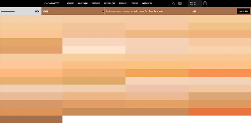
Each company takes a slightly different approach to skin tone and no two brands have the exact same palette (though some are more similar than others). Some companies have more shades than others, with some biased or specializing in different parts of the spectrum. This MAC Studio Fix Powder Plus Foundation‘s 53 shades, for example, does not seem to cater to many black people:

Many companies who have a larger range explicitly classify shades of foundation using some variant of this formula: cool/neutral/warm + color name + fair/medium/dark skin + yellow/red undertone. This descriptive label is often accompanied by an evocative, one or two-word name (e.g Honey, Narobi, Bowie), though in some cases the descriptive label and name are mixed into a single shorthand. Despite some overlap, there is no general consensus on how to name these colors or even how shades are grouped. MAC has sorted them into three sections, Huda into five, and Fenty has some form of a 8x3 grid.
After examining so many rich approaches to skin tone, my previously developed set of six colors seemed paltry and underwhelming. I felt like I wasn’t capturing the range and diversity of human skin at all; the palette wasn’t an inclusive one.
Sidenote: I’ve pulled colors from the companies’ public-facing websites, which, depending on the company/website, may not be a 100% accurate representation of the product’s color in real life. But short of buying and taking photos of everyone’s products, this seemed to be best solution for now.
Updating my skin tone palette
Here is my starting point, from my last post:
To create a new palette, I picked colors from my research into foundation products following a number of self-imposed rules:
- Use brands for the colors that they’re “good at” or specialize in. The palette below uses colors from Fenty Beauty, Lancôme, Huda Beauty and Etude House.
- Pick enough colors to capture the breadth of what I see within makeup products, but not so many that it becomes hard to visually differentiate between colors.
- Stay away from colors that are too red. Amélie Lamont (a former makeup artist) advised me to steer towards more natural yellows, and stay away from the reddish tints proferred by many makeup companies.
- Take hue into account: people’s skin have differing base colors. This is one of my main gripes with using the Fitzpatrick Scale, which is a one-dimensional, light-to-dark system.
- Don’t present the palette as a linear strip. If we present the palette as a single row of colors, people will automatically read it as a uni-dimensional light to dark scale. By laying it out into two dimensions, we’re creating room for a whole new level of nuance.
Here it is: inclusive skin tone palette 2.0
| White (hue 17-23) #ffebe3, #f5c09e, #dea67b | |
| Yellow (hue 29-37) #ffeed3, #ffd1a6 | |
| Olive (hue 30-33) #dbb288, #bf8d50 | |
| Brown (hue 22-26) #dc8d54, #ae5a18, #874c2b, #553117 |
It’s worth mentioning that as a cartoonist, I’m biased towards bright, exaggerated color differences a little more than the average illustrator, and this palette is definitely not photorealistic (though that itself is a complicated subject depending on how you light a scene).
I’ve begun using the colors above on a few illustration projects, and they have served me well so far. In one case, I drew a crowd scene so I was able to use the full palette as a gesture of inclusivity. But in other cases, this palette simply gives me more options, say, when I want to set a scene with East Asian people but don’t want them to all have the same color skin. Of course, inclusive illustrations should go beyond just having different skin tones – people should dress, act and look like they’re from specific cultures and/or ethnicities - but having a solid palette of skin colors is a good place to start.
Much of the research in this article was seeded by conversations with Amélie Lamont, Divya Manian and Sylvia Chong. Thank you.
Related articles:
The previous article in this series:
Inclusive Illustration Research: How Emojis Handle Skin TonesOur follow-up article in The Pudding:
Beauty Brawl: How inclusive are beauty brands around the world?