Inventing a graphic design system that includes Mandarin and Cantonese, Traditional and Simplified Chinese

When the three of us (Jason Li, An Xiao Mina and Jennifer 8. Lee) came together to write The Hanmoji Handbook: Your Guide to the Chinese Language Through Emoji, we challenged ourselves to do better in representing the rich diversity of the Chinese language. Most books today simply choose one form of Chinese — usually Simplified Chinese characters with Mandarin Pinyin — and presents that as the one and only form of Chinese. This unfortunate presentation overlooks the linguistic diversity of the Sinophone world, including the hundreds of ways Chinese is spoken and the dual written standards of Traditional and Simplified Chinese. Even within our author team, we didn’t share the same preferred written or spoken form, so it never made sense to force ourselves to pick one of each.
While it would be impossible to cover the full breadth of the Chinese language, we were able to draw upon the expertise of all three co-authors to create a design system that includes two written standards (Traditional and Simplified) and two spoken forms (Mandarin and Cantonese by way of Pinyin and Jyutping respectively). This two by two system accompanies almost every instance of Chinese in our book. While this system is already a significant innovation in the publishing world, we acknowledge we were only able to capture a small fraction of the many expressions of Chinese, and hope others will be inspired to build upon our work to create future systems that encompass an even wider range of the language.
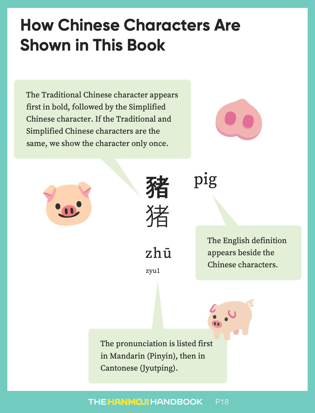
Finally, we come to the design system itself. Here’s a page from our book showing what we came up to show both Traditional and Simplified Chinese simultaneously alongside pronunciation guides in Mandarin and Cantonese:

Explaining our design system
As the only graphic designer among the three of us, I was tasked with making the first drafts of the above system. To do that, I followed the rubric that our eyes parse multiple, discrete things on a page (or screen) better if they look different, preferably in a clear visual hierarchy where one thing is bigger or bolder than the other. As you can see in the final result, this method of visual differentiation persisted through to the final design, after being workshopped with my two co-authors and through further enhancements by the design team at MITeen/Candlewick Press (h/t Vera Villanueva and Nancy Brennan).
But beyond simply making things bigger or bolder, there are specific reasons why we made some parts bigger or bolder than others:
- Between the two written scripts, Traditional and Simplified Chinese, we opted to show Traditional first because a) its forms often look more like the original logograph that they’re derived from, and b) it is generally easier to see how a character shifted from Traditional to Simplified rather than vice versa.
- Some Chinese characters can look very complicated to beginner readers, so it was important that the written Chinese characters stayed big and legible. As a consequence, we chose to differentiate them through boldness rather than size.
- Between the two pronunciation systems, Mandarin Pinyin and Cantonese Jyutping, we chose to show Mandarin Pinyin first because Mandarin is spoken by more people globally, and is by far the most popular and accessible choice for beginners. (As a side note, we chose Pinyin over Zhuyin as the romanization system for Mandarin because the former is more commonly taught and is easier-to-grasp for English speakers. And we chose Jyupting over Yale as the romanization system for Cantonese because the former is more accurate, popular and is a newer, more modern system.)
- In the case of the two pronunciation systems, we decided to differentiate the two by size rather than boldness because it is a different method to create a visual hierarchy. If we had bolded the Mandarin Pinyin, it might have confused readers into thinking that the Mandarin Pinyin in bold is supposed to be used with the Traditional Chinese character in bold. (This is not the case: either written script can go with either pronunciation system.)
- Lastly, the definition in English is, of course, important, so we made sure it was relatively big and legible. But since both the English definition and pronunciation guides use the Latin Alphabet, we placed the former to the right rather than below the Chinese character to make sure they were clearly apart from one another.

A derivative design system for paragraph text
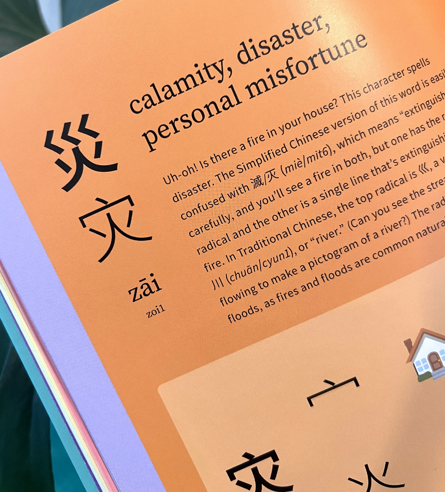
Sometimes, we also had to refer to Chinese characters in the text of a paragraph, where we didn’t have room to lay everything out using our full design system above. In those cases, we went with a shorthand of simply placing the Traditional Chinese character(s) before the Simplified one(s) with a forward slash (/), followed by the pronunciation in Mandarin and Cantonese in italics, with another forward slash separating the two. Here are two examples of what this looked like in our book:
- 鮮/鲜 xiān/sin1 (“fresh”)
- 滅/灭 (miè/mit6), which means “extinguish”
In cases where the Traditional and Simplified Chinese characters are one and the same, we only show the character once as shown in the following example:
- 羊 (yáng/joeng4) is the character for goat or sheep
In our earlier drafts, we wrote only what we intuitively felt was necessary in the context of the sentence (e.g. the written Chinese character by itself or only the pronunciation in one spoken language). But our editors at MITeen/Candlewick (h/t Olivia Swomley) were quick to point out that laying out all of the forms consistently and exhaustively would be the best option for readers, especially since they will already be used to the other design system where everything is included.
Borrow & remix our design system!
Graphic design systems can (and should) not be copyrighted or patented, so feel free to borrow or remix our design system. Maybe your textbook prioritizes Cantonese over Mandarin, or requires the addition of a third spoken language. Maybe your children’s book only uses Traditional Chinese characters but still wants to retain pronunciation guides for Mandarin and Cantonese. We highly encourage everyone to invent design systems of their own and most importantly, to break free of the idea that only one written script and spoken language can “fit” into the confines of a book.