My experience after shipping three projects with it
Tachyons is an up-and-coming, atomic CSS framework. Having just wrapped up my third project that uses Tachyons, I wanted to share a bit about my experience with it – particularly because not much has been written about how people actually use Tachyons.
Over the past year, I used Tachyons as the CSS framework for these projects:
- Vanilla Milkshake open source Wordpress theme
- Jason Li Comics site
- Access My Info Hong Kong (built in conjunction with these folks)
Overall, I was very happy with Tachyons both in terms of the designs I was able to make with it, as well as the way it facilitated my design process. I plan to continue using it in any future web projects that I work on. Unfortunately, all three projects were relatively small and only one was a team effort, so I can’t say much about how Tachyons performs on a massive scale or across large teams.
Author’s note: The examples below are written in a verbose form of Tachyons, which, on top of being my preferred flavor, is easier to read for beginners. Having said that, most designers and developers I’ve spoken to use the regular, abbreviation-heavy form.
Why Tachyons works for me
It’s like inline styles and that’s a good thing
Tachyons consists mostly of single-property classes. So to make a <div> float left and clear left, I would write <div class="float-left clear-right">. While this may seem like a lot of typing, there are several advantages.
First, if you already know CSS, then you know how to use Tachyons. I already know CSS, so I was glad that I didn’t have to learn new naming conventions or other people’s metaphors for how they thought about webpages. (This also applies when I was collaborating with other developers – I didn’t have to worry that they wouldn’t understand what my classes did.)
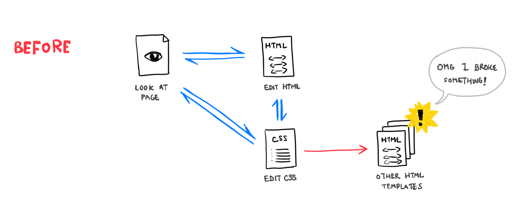
Secondly, styles are localized at the HTML template level, rather than being controlled by central CSS files. This fits my workflow because I usually work through a website’s design one page at time…

…whereas before, I often ran into the problem of editing the CSS file to make a design change for one page, only to cause a ripple effects that broke other pages.

As Sebastian Hermida writes on the DNSimple blog:
CSS is fragile. Pages and elements breaks easily and in the most unexpected ways.
@thomasfuchs: “Two CSS properties walk into a bar. A barstool in a completely different bar falls over.”
Its default sizes and colors make it a powerful rapid prototyping tool
Tachyons also comes pre-packaged with a series of sizes…

…widths…

…and colors…

Not only has this forced me to use consistent values across my designs, but it’s allowed me to swiftly write HTML templates without switching over to a CSS file to define 1rem here and 0.5rem there.
It gives me full control over the (responsive) design
Styling in Tachyons happens one class at a time, and almost all classes have variants across several screen sizes. So if I wanted a <div> to increase its padding for larger screens, I’d write <div class="padding-small-ns padding-large-m padding-xxlarge-l">. This gives me full control over my layout, and there’s no default “Tachyons style” that I feel compelled to adhere to.
It’s fully customizable
Tachyons is made from a collection of customizable CSS modules. True to its nature, its modules are self-contained and do not contain any complex dependencies, so it’s easy (and safe) to customize.
In my case, I renamed classes into their verbose and unabbreviated forms (display-inlineblock instead of dib), toned down the type scale (h1 is 2rem instead 3rem), and added extra width sizes (0.0625rem and 90%).
My one gripe: I’m typing the same things again and again
The only issue I’ve run into is that I’m often copying and pasting a set of classes from one template to the other, or typing them several times on a single template. In theory, I should be building elegant HTML templates with functions/snippets so that every bit of my template is unique. But in reality, there are many cases where, say, I’m re-using a <div> three times, and it would be odd to build a custom function/snippet just for that.
Having said that, I find that typing something multiple times is a better, less frustrating use of my time than having to chase down unintended CSS ripple effects, and trying to correct them using increasingly specific overrides.
Based on the above reasons, Tachyons is my current CSS framework of choice. There are many other aspects of the framework (it renders fast!) that I didn’t cover because they did not come up in my recent projects. I hope that this article has given you at least a basic understanding of the framework, and has enticed you to take it out for a spin.
For more information about Tachyons, check it out its project page, GitHub repo and Slack channel.