Robin and I had been working together on various projects when he approached me about designing the website for his soon-to-be-launched art gallery. Aware that we both had quite a bit on our plates, we initially aimed at creating a quick-and-easy Indexhibit site for the launch and then collaborate on a more comprehensive solution in the future. So within the week I agreed to the project, I received a brief from him and set myself to work. Several thumbnail sketches and email exchanges later, I began to experiment with Indexhibit to figure out what sort of constraints it had.
It did not look good. The Indexhibit platform may be powerful in its simplicity, with many artists, designers and galleries as happy users, but it was too restrictive for our purposes. Its fixed, default structure did not suit our purposes. For example, it didn’t allow enough flexibility in how users navigated through the different levels of the website, not to mention its reliance on a fixed, left sidebar. We quickly went on a hunt for new platforms.
I’d worked with WordPress in the past and I knew that it wasn’t optimally suited for a gallery website. So I kept it in the back pocket as a backup. We turned our eye to other CMS solutions, some of which had been built specifically for art galleries or institutions. Unfortunately, they were either too simple or too complex, and in some cases, not worth the price. Remembering that I’d read about an Indexhibit alternative in swissmiss a while back, I went back to her site to dig for it and re-discovered Stacey.
Over the next two weekends, I began fleshing out Robin’s gallery website using Stacey, building on a boilerplate placeholder website we’d rolled out previously. It took some time to learn the nuances of this new CMS system, but I eventually managed to bend it to our needs, without needing to modify our original design in any way. (Some of the information hierarchy did change based on Stacey’s constraints, but it was more a matter of swapping “a” for “b” rather than cutting any sections or features.)
Using Stacey, I rapidly prototyped a version of the site, threw it up on the web and showed it to Robin. The design was iterated over the next few weeks through a series of IM, email and face-to-face discussions. Some sections were not covered in detail in the original brief, while other pages had to be re-arranged after we filled it with real information. Most of all though, we both had strong opinions on the visual design and the information architecture, and pushed many features back and forth until both of us were happy with the end result.
The site was launched on the 15th of November, three days ahead of the gallery’s first pre-opening exhibition, and we’re both extremely happy with the way it turned out. Almost every section of the site has a different layout to match their respective information requirements; the visual design is minimalistic and focuses on the works rather than itself; and it’s robust and extendable. Much to my surprise, people have mentioned the website, to Robin and to myself, and I’ve received compliments about its simplicity, accessibility and design.
See the results for yourself: http://www.saamlung.com
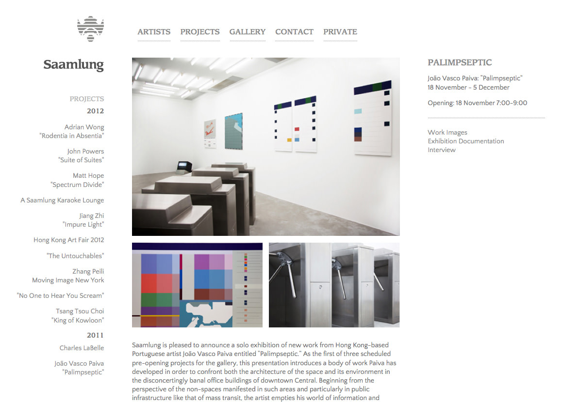
P.S. The work image shown above is from João Vasco Paiva Palimpseptic exhibition.