As part of my job at 3D Avatar School I had to reinvent our product’s user interface. Our product is an online language learning MMOG (massively multiplayer online game), which meant I could draw inspiration from a wealth of MMOGs and study their work before I took the leap myself.
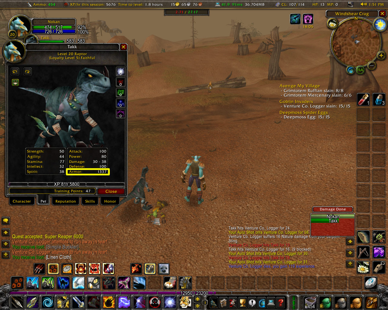
While I can’t share the final results of my work, I did want to share the highlights of this survey of other games, particularly so little has been written about UIs in MMOGs/MMORPGs. In my analysis, I started with the MMORPG classic of our time, the World of Warcraft, screencapped above.
Their UI follows some basic principles: Keep the center area free for action, and swarm the sides with all sorts of actions, options and information. It’s obviously not an easy system to master and assumes that the user has good hand-eye-mouse coordination. But as complex systems go, the interface is not that much more crammed than the one in Adobe Photoshop, except that World of Warcraft puts lots of color, texture and depth into each little icon or frame. It also uses two computer RPG interface conventions – selectable actions as icons on the bottom, and a live mini-map on the top right.
And WoW does allow for customization:
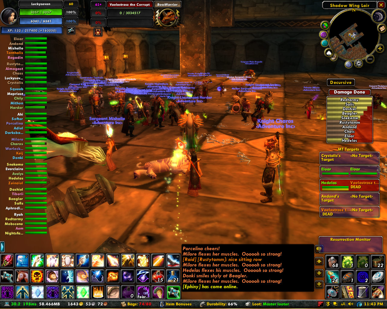
I’m particularly impressed by how the user from the above screenshot took care to arrange all of the little windows into neatly-bounded areas on their screen. In terms of complexity, World of Warcraft‘s UI is up there, alongside airplane pilot cockpits and fictional sci-fi HUD (heads up display) control systems.
Moving down on the complexity scale to the bottom, we have another classic, Disney’s Club Penguin. It sports a simpler UI for a younger, more novice audience:
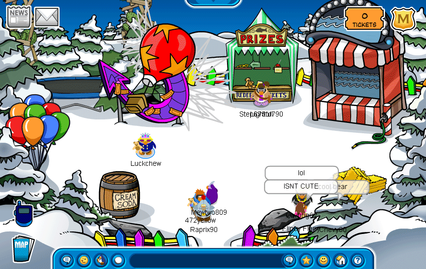
Club Penguin’s designers have decided to highlight chat, and it’s very prominently featured at the bottom of the screen. European social network/virtual world Habbo Hotel also places their chat bar in this central position. The non-chat items have been relegated to the corners, in large friendly-looking icons. Where World of Warcraft had action icons on screen (click the icons to cast a spell, drink a potion, wield a sword), most of the icons here are shortcuts to other windows (bring up the map, show me the news, go to mail).
In fact these UI elements disappear when the user enters a mini-game; compared to World of Warcraft where the icons along the sides are always-on:
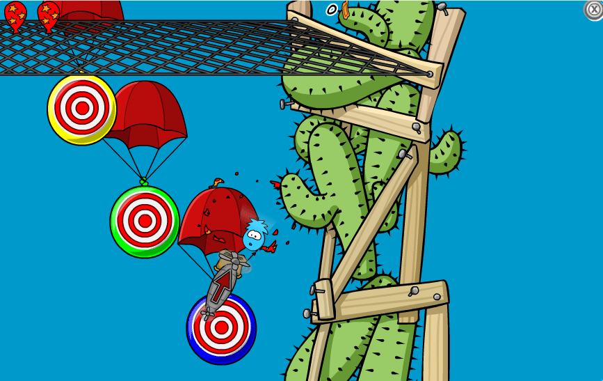
Obviously, Club Penguin can get away with it because games only require simple point-and-click interactions.
Somewhere between World of Warcraft and Club Penguin, is Glitch, an up-and-coming MMOG co-founded by one of Flickr’s founders:
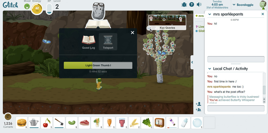
The interface is neither as messy and cluttered as the World of Warcraft, nor is it as super-simplified as Club Penguin‘s. The UI within Glitch is very clean. Lots of white (or almost white) space is being used to convey a sense of emptiness, even though the screen is quite full of information and options. Like World of Warcraft, there is a row of action icons on the bottom, a mini-map on the top right and the character status floats on the top left. Like Club Penguin it focuses on chat, although the way it’s designed resembles chat in Google Mail or Facebook.
Each of these three games play very differently and target very different people, so it’s hard to draw any across-the-board conclusions. In the course of studying and playing World of Warcraft and Club Penguin, I got a sense of what the establishment had done. With Glitch, it was exciting to see a new player innovate in this space, which is exactly what we hope to do.